Where Innovation Meets Imagination
Lemon Juice Media is a creative studio that transforms brands through cutting-edge content creation. Elevate your visuals with us, where innovation meets imagination. Our ethos is simple: do great work with good people. We’re the creative partner of choice for brave brands who want to stand out and shout louder.
UX Design
In our UX Design Portfolio at Lemon Juice Media, we showcase our commitment to creating intuitive and engaging digital experiences. This collection features a diverse range of projects that highlight our ability to blend creativity with strategic design thinking to deliver outstanding user experiences.
Our portfolio presents a variety of UX design solutions, from sleek website interfaces to seamless app experiences, each crafted with a focus on user needs and business goals. Through detailed case studies, we illustrate our process—from understanding client requirements and overcoming design challenges to implementing innovative solutions that drive success.
Game Hub
PC • Tablet • Research • Personas • Wire-frames • Flowcharts • Prototyping • User Interface
Project Overview:
The Goal of the project was to design a centralized hub for someone’s computer game collection of installed non online hosted games.
This would amalgamate all short-cuts into one application that displays the games and the hours played in an aesthetically pleasing and easy to use way.
This program must also allow parents to decide what games they allow their children to use, and enables them to monitor screen time.
Who, What, and Why?
The client and I started with strategizing and determined the target audience. Upon the completion of this research, user personas based upon this were written, splitting our personas up into 4 distinct user categories. Each of these user categories have specific needs when interacting with this program and therefore need to be defined separately.
The application is aimed at those with multiple different games across many different platforms, instead of having to find each game on a different platform you simply add it here and it keeps all of your games in one place.


My Contributions
I was the only designer on the project so everything you see I created myself. I was involved in every stage of the design process from creating the personas, designing flows and wire-frame diagrams, all the way to creating the final UI design and coding the application.
Desining the Flow
The next step was to proceed in the creation of the flowchart showing how the program would be organised, and how each of the screens would interact with one another, outlining the basis for how a user will use the program.

Wire-Framing
After we defined the flow and thus what screens and pages were needed, I proceeded to create wire-frames to explore the experience in more detail. The main focus at this stage was on the login, user screens and adding new games.


During the Wire-framing process I reviewed the size of the buttons that each age group would interact with, providing a wire frame mock-up of each size. As the click size for younger children needs to be much larger than adults, due to the fact that their motor skills are not as adept, their buttons were the largest. This meant as the individual grows older, the buttons can get smaller until they reach the size set for an adult account.

Teen & Adult View-port

Older Child View-port

Young Child View-port
UI Background Colour
Upon researching preferred colour profiles for various age groups, I picked a selection of colour swatches and asked a group of possible users their preferred colours. I discovered that younger audiences prefer much brighter colours, while older audiences prefer more muted tones. From there I picked the two most popular options which would work for those under the age of 13 and those above. I then implemented a concept design for the backgrounds.


Flow Widgets
I joined this existing project to help give it some direction, as the developer was struggling to set himself apart within the market. The app needed its flow improved and updated, so that it could function more towards the target demographic.
Who, What, and Why?
The client and I started with reviewing the brand and its target audience. Since this was an existing application, the client already knew his target demographics. However the flow of the application didn’t seem to impress them, with a number of users stating that it was “Unintuitive”.
The target markets were users of the IOS operating system who wished to get more out of their phones by Jail breaking them. This is already a small market before, and an application that is difficult to use is reducing an already small demographic further.
IOS • Redesign • User Interface • Wire-frames • Flowcharts • Prototyping


My Contributions
As this was an existing app, the first step was to review the flow and overall aesthetic of the app. After that my job was to simplify the process as much as possible while improving the visual appeal. The most important part of the project was redesigning the flow that ensures a smooth experience for the user.
Revising the Flow
One of the first steps I took was to look at the current way in which the app was structured, and then to identify any issues with the flow. The flow turned out to be very counter intuitive, a fact that was agreed by customer reviews, and so a restructure was necessary to improve how the application worked, completely changing major interactions while tidying up minor ones.

Redesigning the Layout
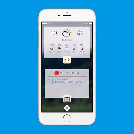
To help users interact with the application, the client and I decided to redesign the overall aesthetic whilst adding helpful shapes to indicate the certain actions that can occur when interacting with the application. Wire-frames were then drawn up with the redesign determining the new layout.


